Designing a double page spread from scratch can seem a scary idea, two entirely blank pages on the screen and lots of content to be put on it.
But how can you make sure your double page spreads are creative and don’t neglect any aspect of design?
JournalismSkills.com this week launched a series on Pinterest, inventively called ‘Double Page Spreads’ with some ideas with the filler headlines providing tips throughout.
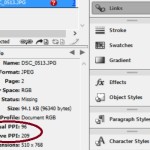
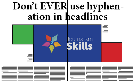
 In this suggestion of a large top half image, with two smaller banner images hemming in the text, the advice given is make sure the DPI of the images are over 300, but also, in InDesign, check the ‘Effective PPI’ as scaling an image up, reduces it’s quality.
The ‘Actual PPI’ is the number of pixels per inch of the original file, increasing or decreasing the size of it will alter the figure, which is expressed as the ‘Effective PPI’ in the Links menu of InDesign.
In this example, stroke text is used to make sure a headline doesn’t clash with a background texture or image. Making the text and stroke opposite colours works well, for example if the photo has light patches and dark patches, it will make sure all of the text is readable.
And never EVER hyphenate a headline:
Check out these tips and more on Pinterest:
And more content available regularly by following:
Journalism Skills

